Contact forms are everywhere. They give prospects and readers an easy way to reach out to you.
If you’re offering services, you can use contact forms to collect all kinds of important information from prospective clients. And if you run a magazine-style blog, your contact form can save you from having to sift through the Just to say Hi! emails and the important ones manually.
While they’re used on just about every website, designing functional, good-looking forms with conversion optimization in mind is easier said than done.
With this in mind, in this post, we’ll take a cue from common mistakes designers make and walk you through seven tips to build better contact forms for your website. But before we begin, let’s quickly go over why it’s a good idea to spend some time on your contact form’s design.
Let’s get started.
Your Contact Form Is Important
Your email address can bring in a lot of unwanted mail to your inbox, forcing you to sift through piles of spam for client orders or queries. A well-rounded contact form will effortlessly collect information from your site’s visitors directly through a web page. This enables potential clients to reach out to you without having to find your email address, login to their email account, and write an email.
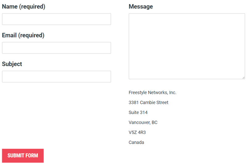
You might argue that it’s just as easy to connect with your clients through social websites like Facebook or Twitter. However, this might not be the best channel for communication because a significant portion of the population doesn’t use them. Contact forms, on the other hand, open up a communication channel between prospective clients and business owners. Here’s what our contact form looks like:
One of the best things about contact forms is that they compliment providing phone support to clients. Round the clock phone support can be incredibly difficult to manage – especially for a small business or a startup. Contact forms offer a convenient way for prospective clients to approach you even if you are unavailable.
As soon as a user visits your website, they start looking for information. What a contact form does is it helps them reach out to you with their specific query, request for more information, or express their interest in your product or service. It gathers relevant information from the user (like their name and email address) and gives them a tailored list of questions to better explain their requirements or refine their queries.
7 Tips to Build Better Contact Forms for Your Website
Anyone can install a WordPress plugin and put together a contact form in minutes. The difference is in its design.
There’s a very small difference between a high-converting contact form and a low-conversion form. Here, we’ll walk you through seven tips to help you build better contact forms for your website and increase conversions remarkably.
Tip #1: Use the Right Layout and Dimensions
Ideally, your contact form should be simple and intuitive by design. Its layout is just as important as the content of the form itself. You shouldn’t expect people to stick around and fill out your contact form if it’s too long or too difficult to make sense of.
Here are some of the key points that you should keep in mind when building high-converting contact forms:
- Sizing input fields. Input fields that are too long or too short are a big NO when it comes to designing your contact form. Best practices indicate that your contact forms’ input fields should roughly be the same length as the expected input for that field. For example, if you’re asking for your client’s zip code then its corresponding input field should have a 10-digit entry limit. You can also do this for phone numbers.
- Aligning labels. You should always put the input field’s label directly above its corresponding input field. Studies show that users are able to complete forms with top-aligned labels faster than forms with left-aligned labels. Plus, they translate well to mobile devices.
- Input fields per row. It is recommended that you do not place more than one question per row in your contact form. This way, you won’t end up with multiple columns in your contact forms which are generally more difficult to scan.
Here’s a look at Scribd’s contact form:
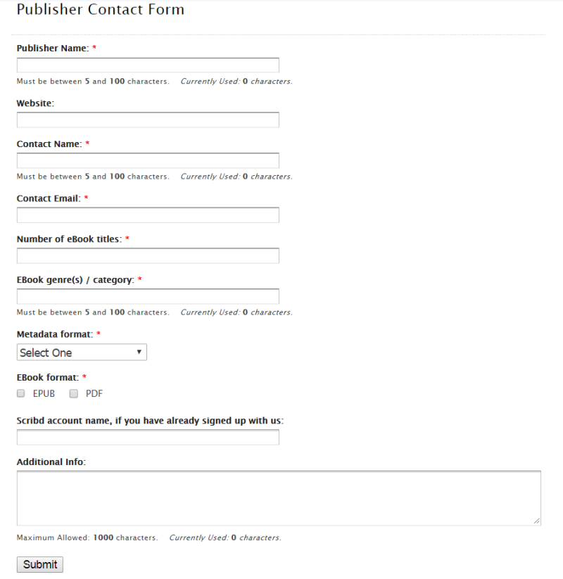
You’ll notice how the input fields are sized appropriately, the labels are top-aligned, and there is only one input field per row.
Tip #2: Build a Neat and Clean User Interface
Striking the right balance between readability and visual appeal takes some skill and a lot of experimenting. This, however, is easier said than done.
Here are a few design tips to help you get started with a step in the right direction:
- Make field labels clear. Use fonts and color combinations that make your contact forms easy to read even for people with impaired vision. It’s also a good idea to maintain consistency across the board in formatting. Finally, make sure you top-align each field’s labels.
- Make it accessible. You should make sure that your site’s end users are able to navigate through the entire contact form using keyboard keys. This improves accessibility and makes it easier to fill out the form.
- Make the contact form brief. Use minimum number of words to describe field labels while making sure they’re still easy to understand. You should also try to gather all of the information you need by asking your visitors as few questions as possible. In addition to this, it’s a good idea to avoid being redundant with the questions you ask on your contact form. For example, don’t ask users to enter a zip code if you’ve already asked them for their city.
- Mark required fields. Traditionally, fields that are required to be filled are marked with a red asterisk. You can also write Required next to the input field or directly below it to indicate that the user needs to fill this out. However, if you require your visitors to fill out most of the fields in your contact form then it’s a better idea to mark the optional field(s) instead.
Leadformly has a simple, three-field contact form on their website:
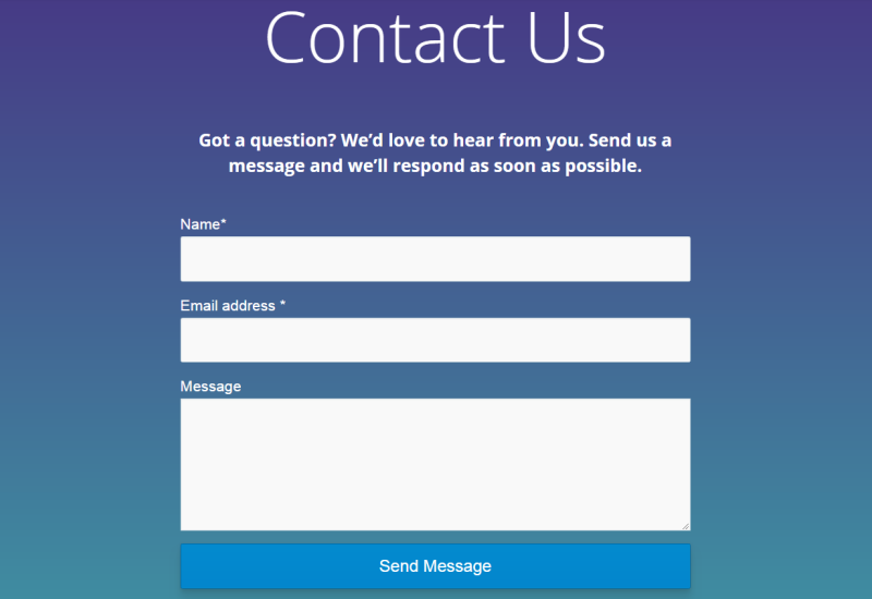
The labels are easy to read, the form is accessible, and they’ve marked which fields you’re required to fill out with simple asterisks.
Tip #3: Don’t Ask for Unnecessary Information
Don’t overwhelm your visitors and prospective clients with a plethora of questions. Be concise. Be brief. The shorter your form is the better. Remember that your contact form is a channel that allows visitors to initiate a conversation with you. You don’t want to push them away by asking questions that might sound intrusive or unnecessary.
As a general rule, simply include three fields in your contact form – name, email, and message.
You don’t need a prospective customer’s phone number or credit card information the first time they contact you. So, it’s a good idea not to ask them for personal information. Studies indicate that forms that require users to give personal information (such as their phone number) when it’s seemingly unnecessary have high abandonment rates.
For instance, if you’re running a web design company then all you really need to ask your visitors for is their name, email address, and message. Asking for a phone number gives the impression that you’ll be giving them a call which is unnecessary, in this case.
Here’s a look at Paravel Inc’s contact form:
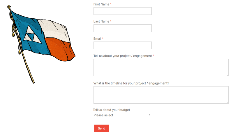
The web design company asks prospective clients a few project-related questions through their contact form. This way, the client isn’t overwhelmed with lots of unnecessary questions right of the bat.
Tip #4: Use Display Helpful Success and Error Messages
It is incredibly important that you use clear confirmation dialogues on your contact forms that tell the user that they’ve correctly filled out all of the required fields. This helps them know that their inputs have been accepted. And when someone misses an entry or enters the wrong character, your contact form should quickly prompt them to correct their mistake.
Similar to confirmation dialogues, your error messages should be helpful and descriptive, as well. For example, instead of saying Please fill all marked fields you might be a little more precise and say Please enter a name if the user forgets to input their name. This simple tip allows users to go back and fill missed fields and correct errors faster.
Tip #5: Describe What Happens Next
A subtle yet effective way to increase contact form conversions is to let your users know what happens when they submit the form. Your submit button is essentially the call-to-action button. For this reason, its text should describe what happens when the user submits the form. The word submit isn’t descriptive enough. Instead, opt for words like Send, Send Message, Send us your message, or Get in touch.
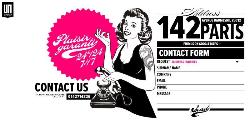
You’ll notice how Ultra Noir’s artistic contact form has a submit button that reads Send.
Tip #6: Style With Custom Branding
Having a contact form that doesn’t fit in with your site’s theme and your brand could potentially be off-putting. When a user sees a simple, black and white contact form on a webpage, they perceive it to be generic – just like any other contact form they’ve filled out.
All you have to do is add elements of your business’ brand to your contact form. You could use the same font that you use throughout your website and try and incorporate brand colors into the form’s fields and buttons.
Tip #7: Make It Mobile-Friendly
A common problem with contact forms is that while it looks great on desktop machines, it doesn’t fare nearly as well on tablets and mobile devices. So, when you’re designing your contact form, it’s a good idea to make sure it looks just as good on an actual mobile device as it does on your desktop computer.
For starters, you’ll want to make sure that all of your form’s text fields are tappable and that the submit button is clearly visible and big enough to tap.
And if you want to go the extra step, you could give your users the correct keyboard by specifying your input type e.g. <input type = “number”> for triggering a numeric keyboard or <input type = “date”> for MM/DD/YYYY style inputs. Enabling context-sensitive keyboards on both iOS and Android devices will dramatically improve your contact form’s mobile usability.
Conclusion
Hopefully, now you know why you need a well-designed contact form on your website. We shared some tips to help you build better contact forms and encourage you to try them out on your own.
Let’s quickly recap the main points you should keep in mind to build better contact forms:
- Use the right layout and dimensions.
- Build a neat and clean user interface.
- Don’t ask for unnecessary information.
- Display helpful success and error messages.
- Describe what happens next.
- Style with custom branding.
- Make it mobile-friendly.
Have you had poor experiences filling out contact forms? We’d love to hear from you so let us know by commenting below.
from Web Development Blog, News and Tutorials https://ift.tt/2KNwRUz
from Tumblr https://ift.tt/2s9dKfX
No comments:
Post a Comment